A company’s logo is hugely important for representing them. They need something that is eye catching, unique, creative and memorable. Some people will forget the name of a business and even what they’re all about, but a logo often stays in their minds so it needs to be designed to be unforgettable! When creating something that has all of the characteristics we mentioned above, it takes careful planning. Many logos actually have hidden meanings and messages that you would never have guessed existed! When you do decipher them, it makes that company even more memorable. Below we have a list of examples showing logos that have hidden meanings and messages. Take a look and test yourself!
Alfa Romeo
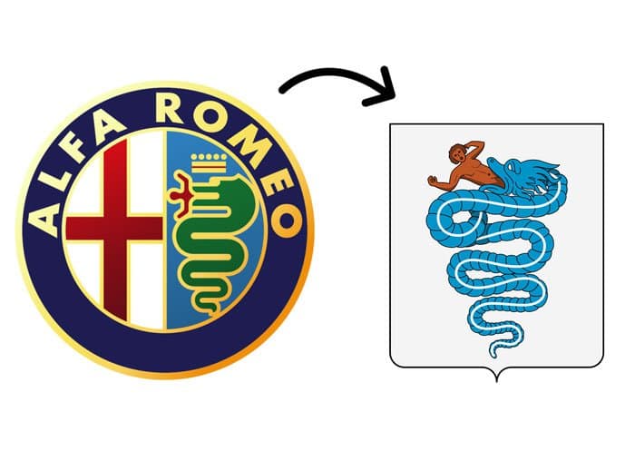
Did you ever realize that the right side of the logo depicts a serpent eating a man? We certainly didn’t!
Amazon
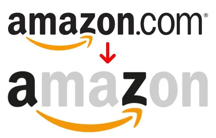
Of course, most people realize that the logo is pointing out A-Z, but the arrow is also a smile!
Baskin Robbins
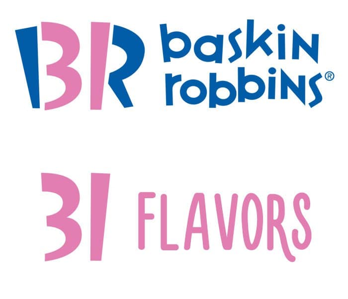
Baskin Robbins produces 31 different flavors of ice cream. As you can see, that fact is incorporated into their logo but it is easily missed!
Beats By Dre
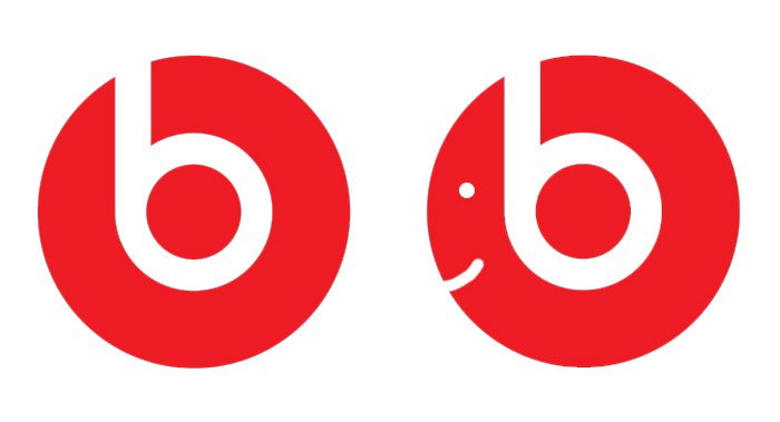
The letter ‘b’ in the logo is actually meant to look like a pair of headphones on someone’s head!
FedEx
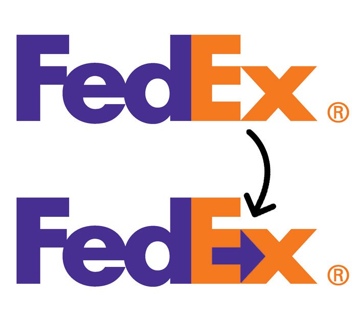
Between the letters ‘E’ and ‘X’ on the FedEx logo, you’ll notice that there is an arrow pointing forwards.
Galeries Lafayatte
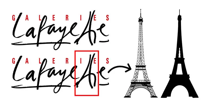
An Eiffel Tower is created by the merging of the double T in ‘Lafayette’.
Hyundai
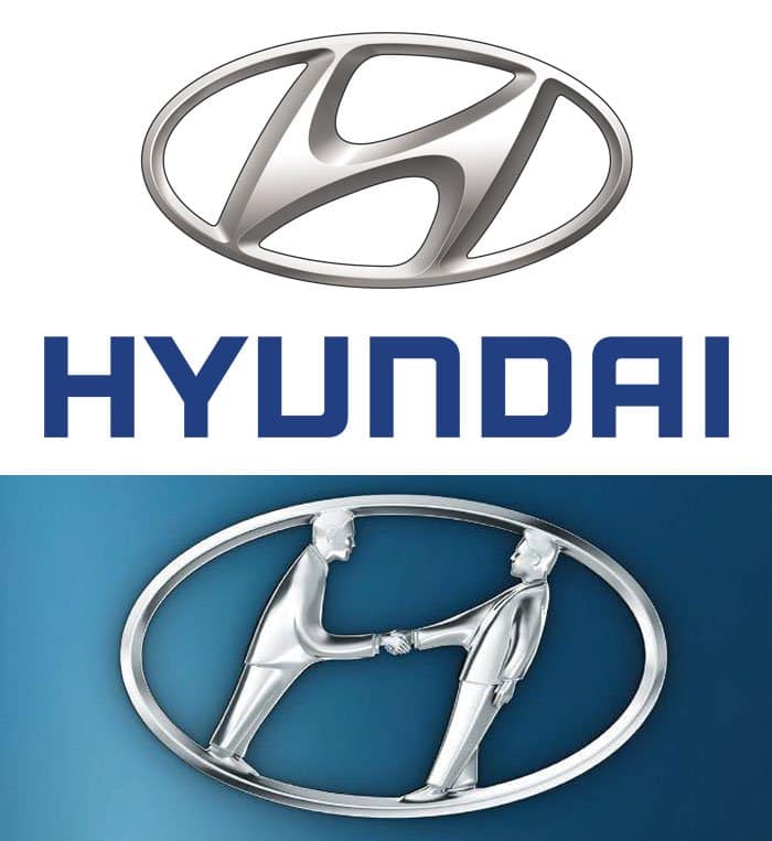
Most people just see the shape of an ‘H’ but fail to see that it represents a handshake between an employee and a customer.
Levi
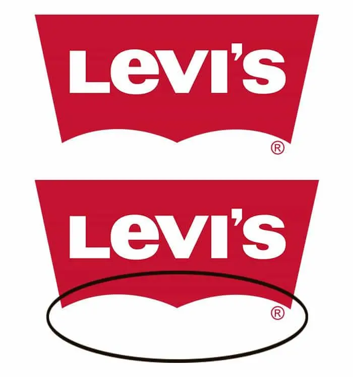
The circled thing is actually meant to represent your bottom!
Well, we don’t know about you but we find some of these super impressive! The creativity that some people possess in their minds is awesome. One thing is for sure, we won’t be forgetting any of these logos any time soon! If you’re currently trying to design a logo for your own business, we hope you have found some good inspiration here. As these examples demonstrate, a logo doesn’t have to be over complicated to be effective. Keep going to see even more hidden meanings and messages!
London Symphony Orchestra
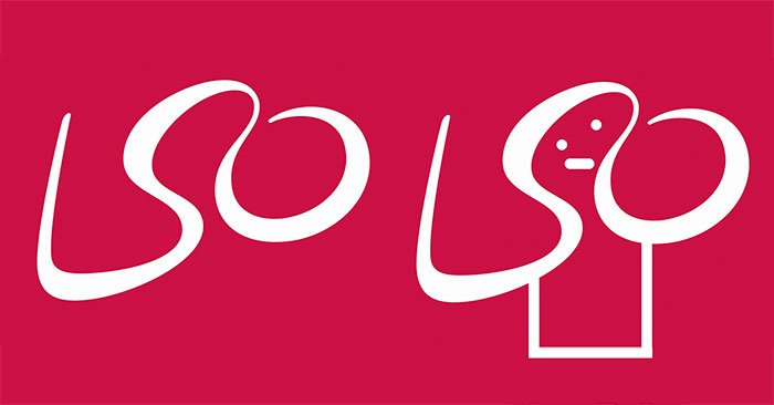
If you add eyes and a mouth like so, you realize that the shaping of the letters LSO is also the shape of an orchestra conductor!
Northwest Airlines
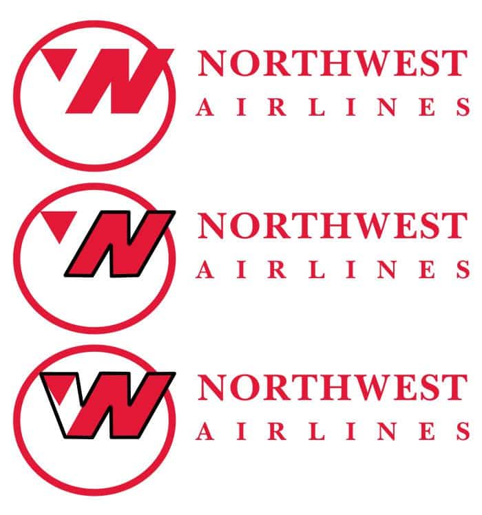
The creative use of typography with this logo merges the letters ‘N’ and ‘W’ which obviously represents ‘NorthWest’. The left over triangle bit is also pointing in a north west direction!
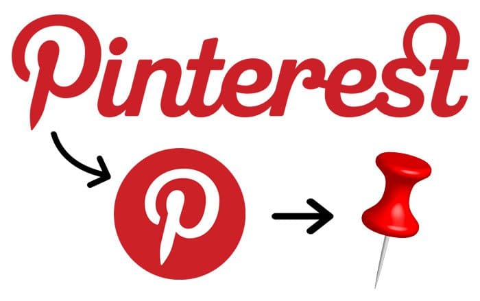
There is some debate over whether the Pinterest logo is the head of a pin or not. The ‘P’ is supposedly made up of a needle and thread.
Quicksilver
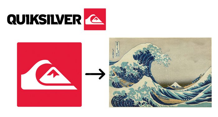
The wave in the Quicksilver logo is said to be a stylized version of the famous woodblock print ‘The Great Wave Off Kanagawa’, however, other people say it it simply a wave and a mountain combined which represents their product range.
Toblerone
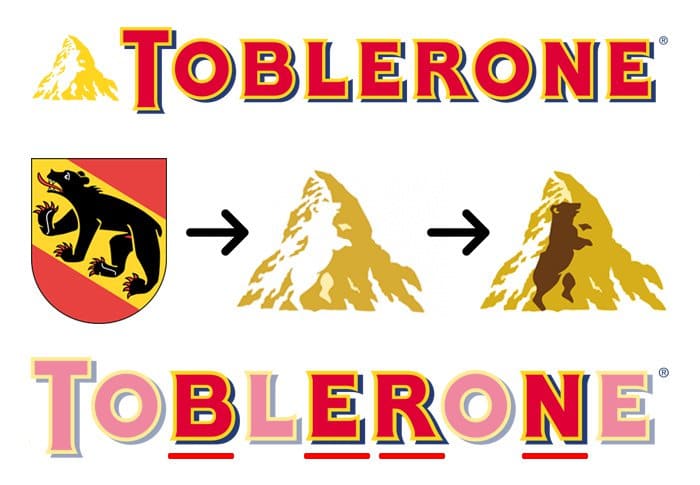
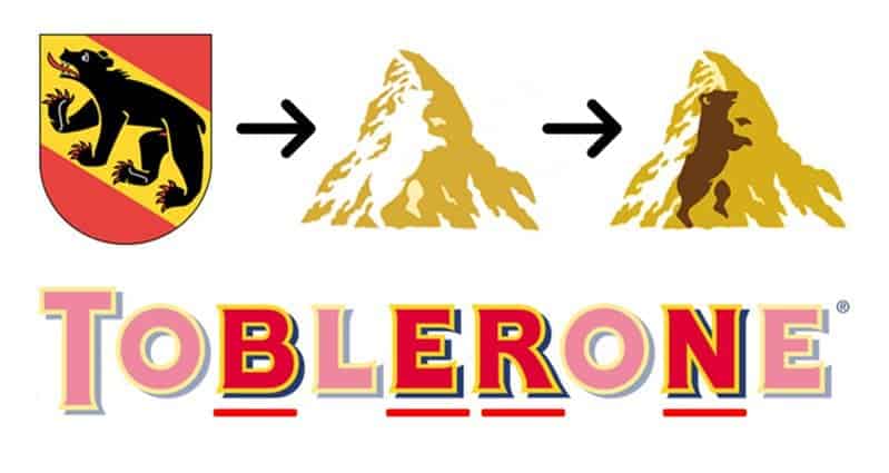
Toblerone chocolate originates in Switzerland, Bern to be specific, which shows in their logo. You may or may not have also noticed that there is a bear hidden in the mountain!
Le Tour De France
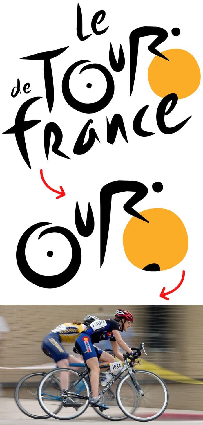
The word ‘tour’ is cleverly designed to look like a cyclist riding!
Toyota

The Toyota badge actually beholds every letter used in the company’s name!
Unilever
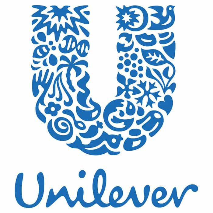
The Unilever logo is made of up images the represent various aspects of sustainable living. How many can you spot?
Source:1

