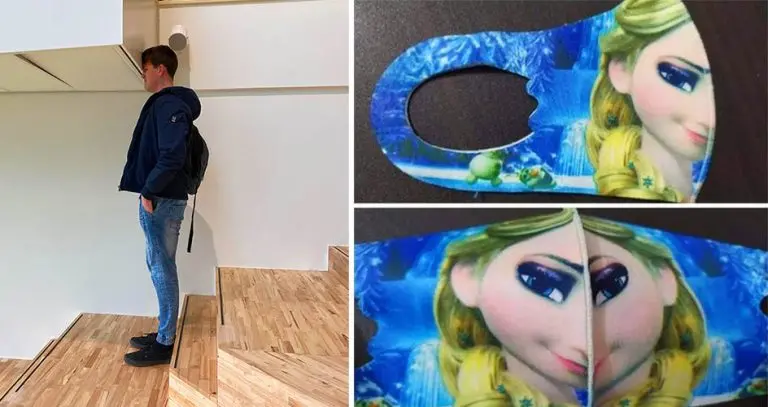
The efforts of good designers are often taken for granted. And it’s only when we see bad designs that we get to compare and appreciate their great works. At least that’s the only good thing about epic design fails. So, it’ time to pay tribute (once again) to the designers who are so bad at their jobs. While we understand that everyone (even a designer) makes mistakes, these failures are so blatantly outrageous that they’re beyond our understanding.
Were the designers drunk when they made these things? Did they purposely mess up their works for some reason? It’s just hard to comprehend how a professional designer can create such an outrageous mistake. Product designs, architecture, advertisements, landscapes, public signage – these things are made to make our daily lives easier and more convenient. But if these things give you more confusion than assistance, that’s how you distinguish bad designs.
Bad Designs That Will Leave Anyone Confused
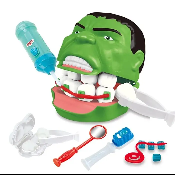
“That’s not where teeth go”
We’ve compiled another list of bad designs that are confusing, frustrating, and just plain thoughtless. Depending on your tolerance to design failures, these examples will make you either laugh or cringe.
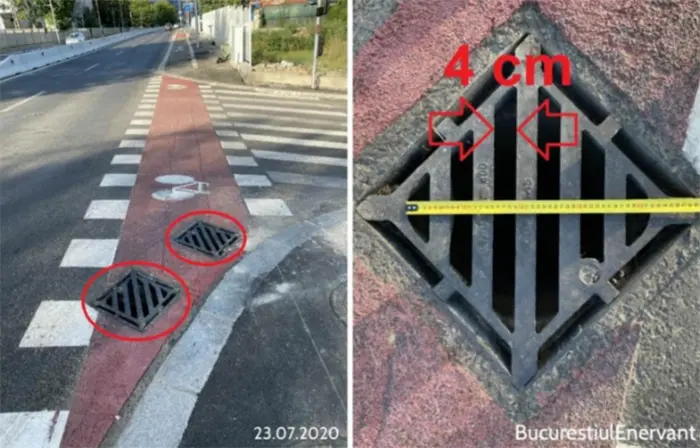
“Sewer cover on bicycle track wide enough for the wheels to get stuck”
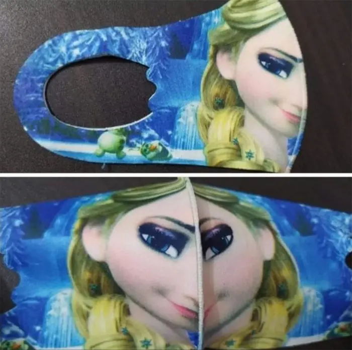
“Looks good on the package, not so much when worn”
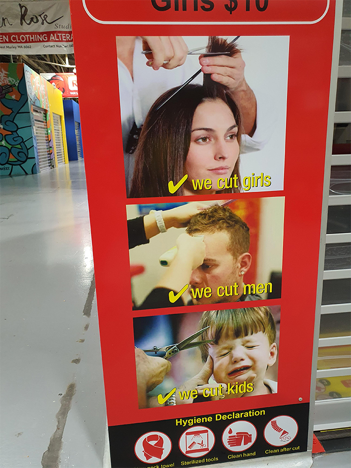
“We cut kids”
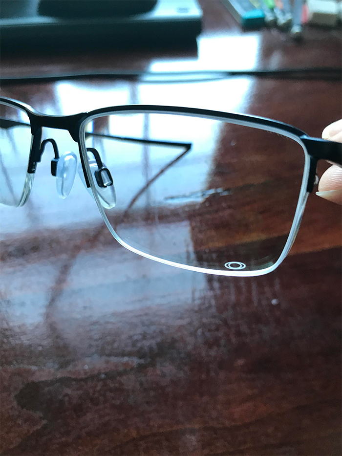
“My glasses have an Oakley’s logo in the bottom left lens. I frequently think there is a smudge on my glasses, but nope!”
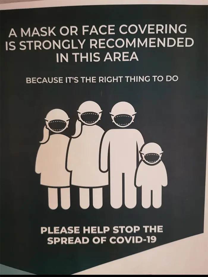
“People wearing face masks looking like monsters”
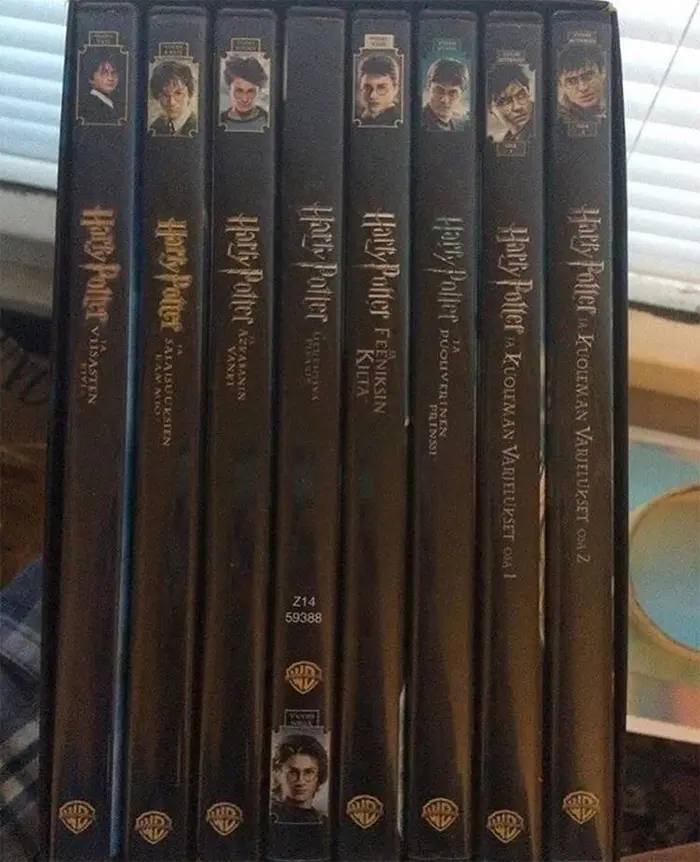
“This Harry Potter DVD collection”
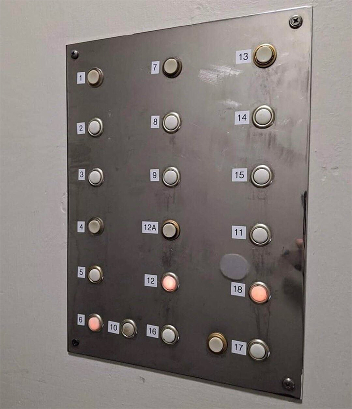
“I’m having an aneurysm just looking at this”
“They built this school like one month ago.”
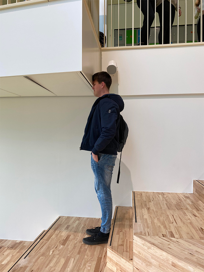
“We don’t need that corner, I guess…”

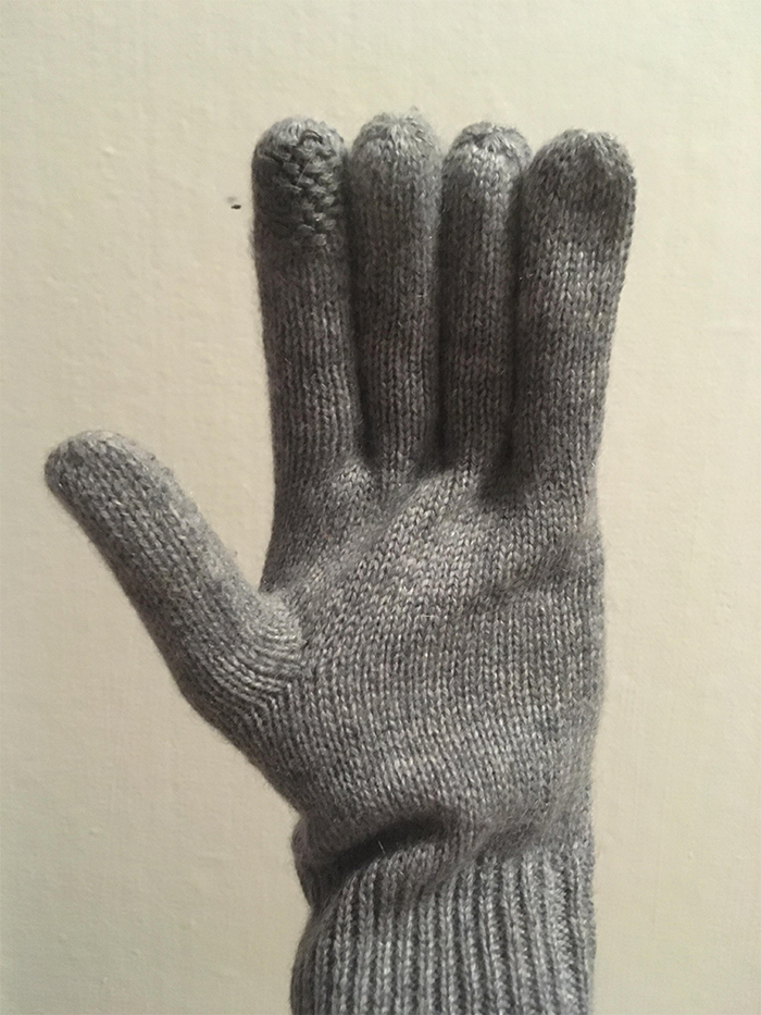
“My girlfriend has a pair of gloves and all of the fingers are the same length.”
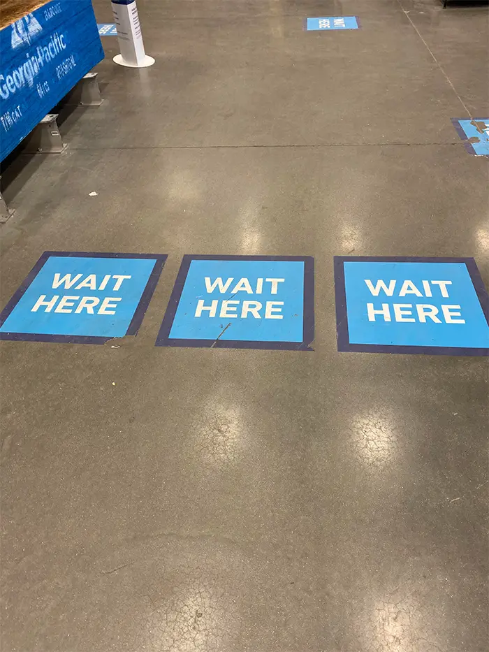
“Luckily Covid doesn’t spread sideways”
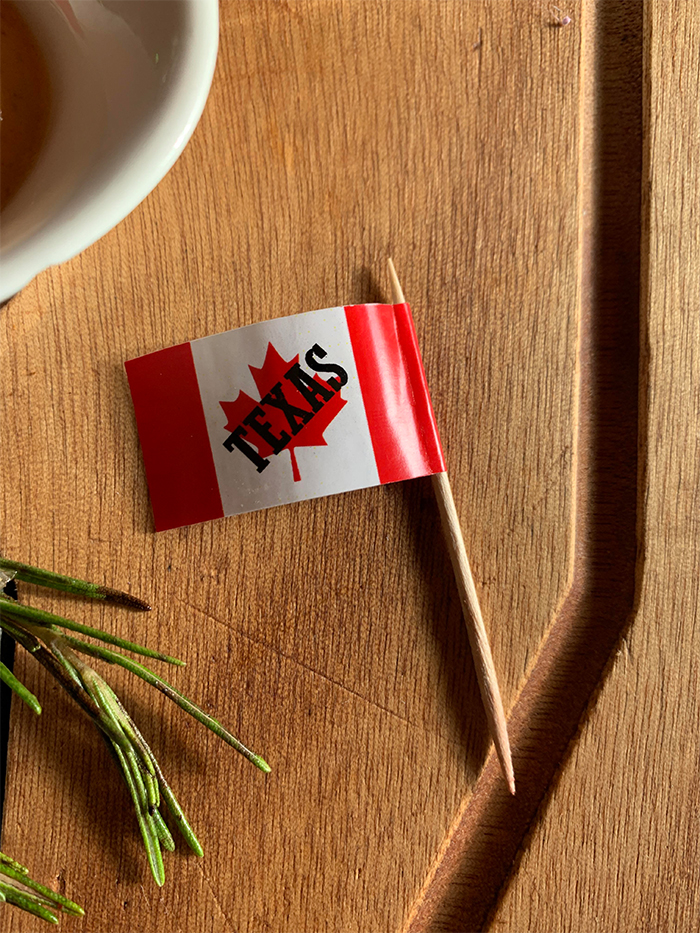
“I think the steak house I went to is going through an identity crisis.”
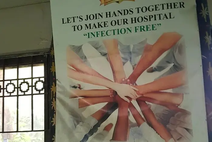
“Join hands” to make hospitals “infection free”
“This intentional design on this hoodie.”

Source: Reddit

