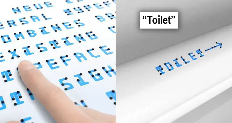
The Braille system allows visually impaired persons to read and write letters, thus allowing them to communicate with sighted people. However, most sighted people have a hard time understanding the Braille, whether with their fingers or with their eyes. For this reason, Japanese designer Kosuke Takahashi developed a new typeface that will help sighted people learn Braille the easy way – the Braille Neue.
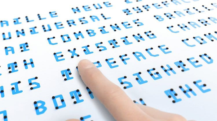
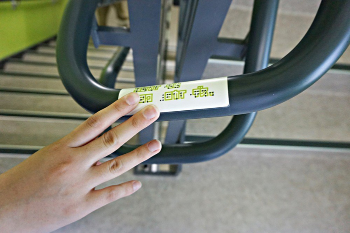
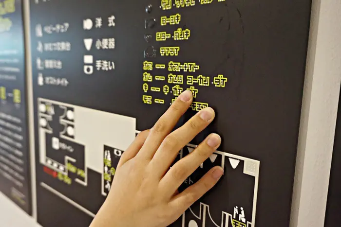
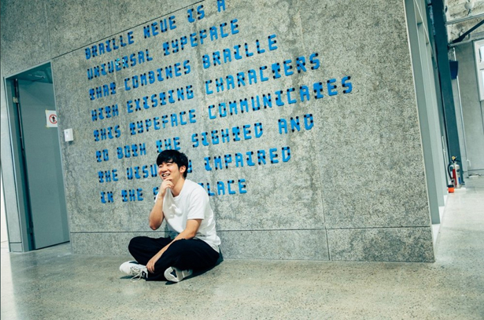
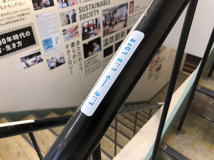
The 24-year-old designer released the Braille Neue, a universal typeface that combines Braille with existing characters. This innovative typeface will give both sighted and blind persons equal access to information. By overlaying the existing characters with raised dots corresponding to their Braille equivalents, more people can get acquainted with Braille. Furthermore, this allows everyone to read public signages whether they can see or not. Developed in perfect timing, this could be implemented in public spaces for the 2020 Tokyo Olympics and Paralympics. It can certainly create a universal space where anyone can access information in the same space.
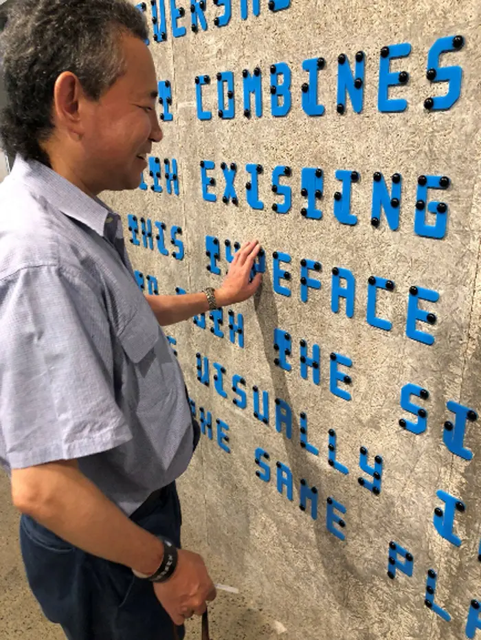
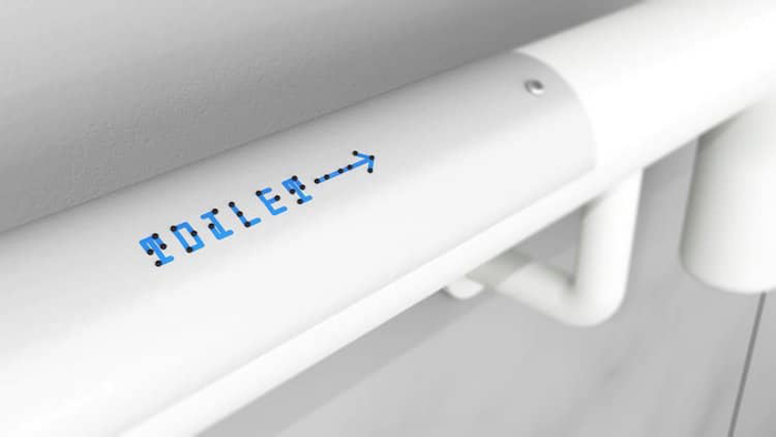
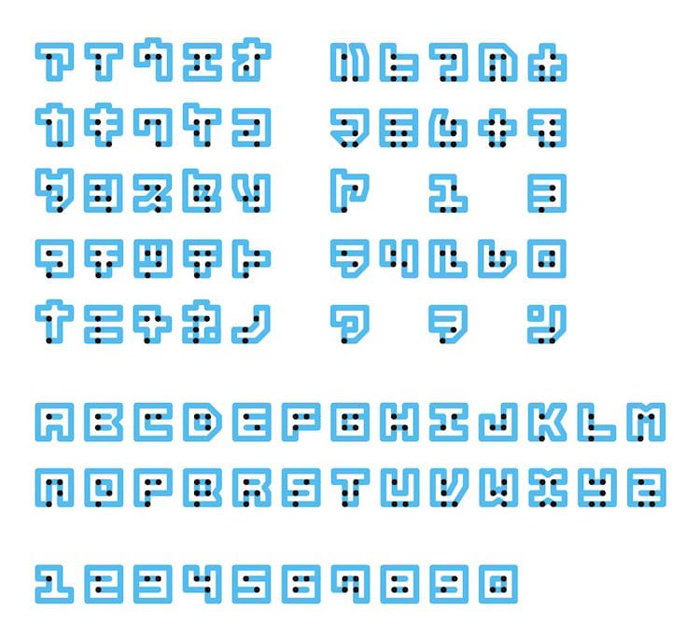
This new typeface is based from Helvetica Neue font. It comes in two styles – standard and outline. The Braille Neue standard combines tactile Braille dots with Latin alphabets. On the other hand, the Braille Neue outline uses both Latin alphabets and Japanese characters. Takahashi came up with the idea when he realized the fact that he can’t read Braille. So, he began to think of a clever way to help people learn Braille the easiest way possible. First, he gathered feedback from both blind and sighted readers and used this information to develop the new typeface. After a series of experiments, he continues to refine the typeface to improve its usability.
“I also conducted a research to see if large signage with braille was readable for blind people.”, Takahashi reveals. “Through the research, I found out that as long as there is the 6 dotted pattern, it is possible for them to read it regardless of its size. Braille tends to be small and invisible, but with Braille Neue it has the possibility to expand spatially into public signages in new ways.”
Braille Neue combines tactile dots and existing characters that makes information accessible for both sighted and blind persons
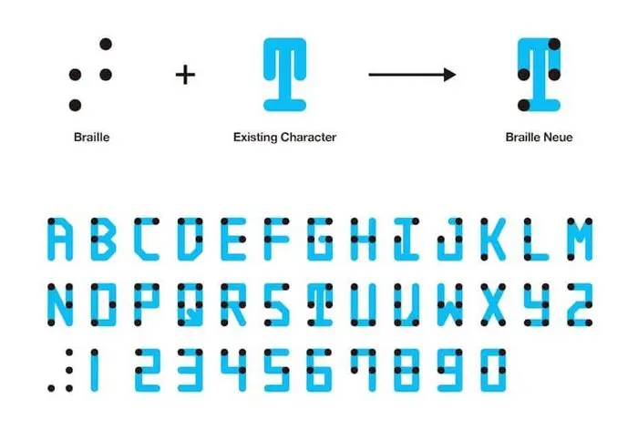
The new typeface comes in two styles – standard (Latin alphabets) and outline (Latin and Japanese characters)

Source: Kosuke Takahashi | Twitter

