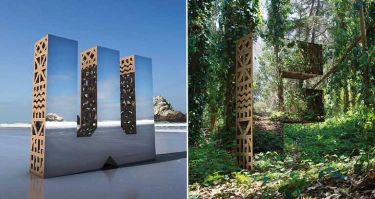
As part of the ever-growing San Francisco Design Week, the people at 'Character', a local design and branding agency, developed their 'Look Closer' campaign. Taking advantage of the fact that the festival organizers had moved some of the events to the 2,000 plus capacity Pier 27, the team at 'Character' felt that this would be the perfect way to get people noticing their concept.
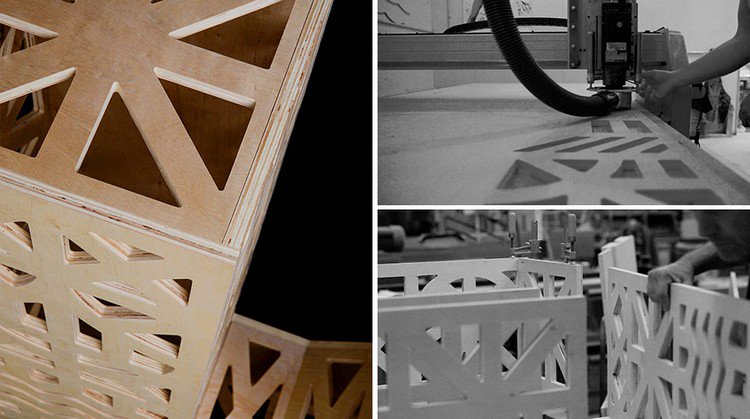
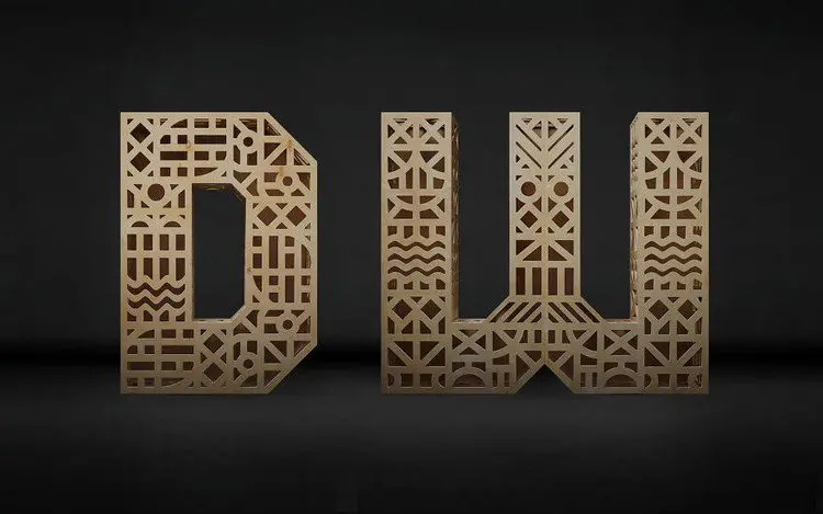
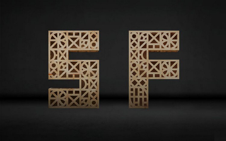
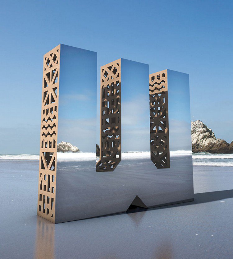
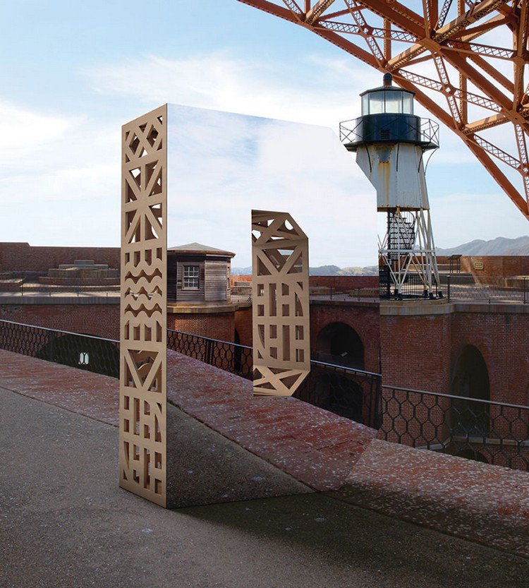
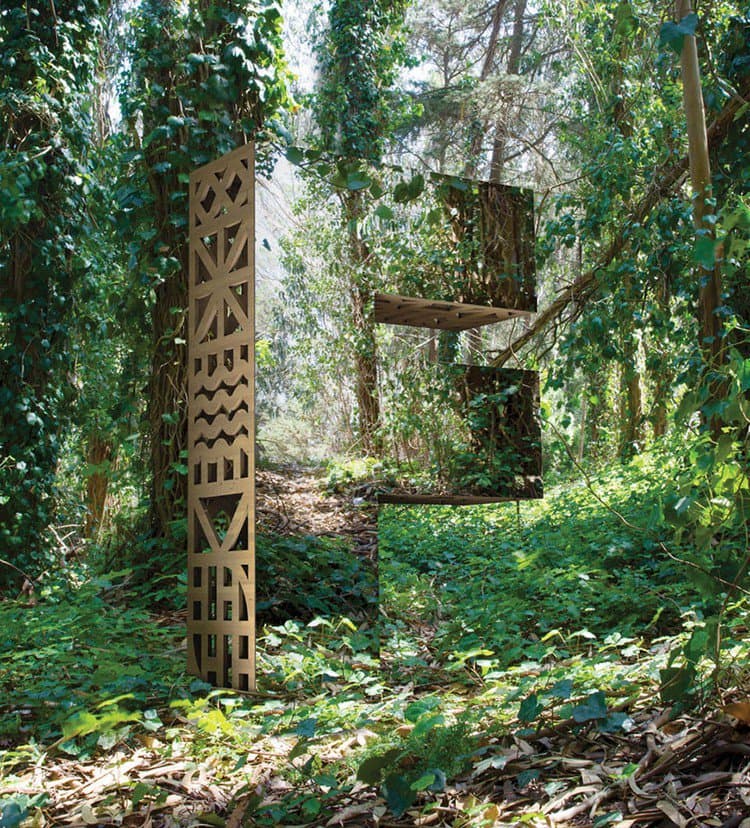
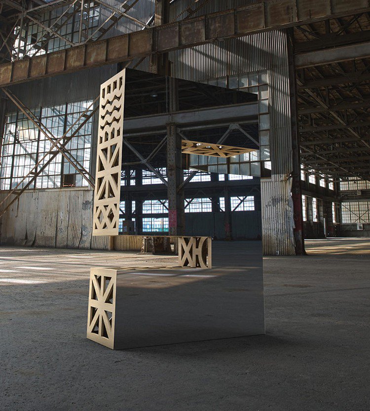
Huge monolithic letters were created from wood and mirrors to show that design is everywhere you look, and is easily accessible even though much of it goes completely unnoticed. Due to their reflective nature, the giant letters can almost go unseen at times until the viewer looks closely. The agency felt that this concept was symbolic of all manmade things, as every single one contains an element of design.
Website: character

Source: 1

