Sometimes, you look at kids toys and something is off. This could be something subtle or it could be something blatantly obvious. Here we have an amusing collection of epic toy design fails that are perfect examples. We can’t help but wonder if some of these blunders were put in place on purpose? We’d like to think of them as unfortunate accidents, but you never know with some people! Of course, many kids wouldn’t notice anything suspect, but for us adults the issues are obvious! Take a look!
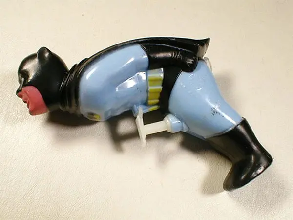
This Batman squirt gun doesn’t feel quite right…
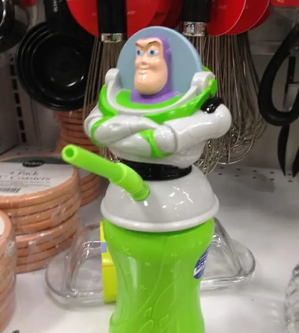
This straw placement hasn’t been very well thought out…
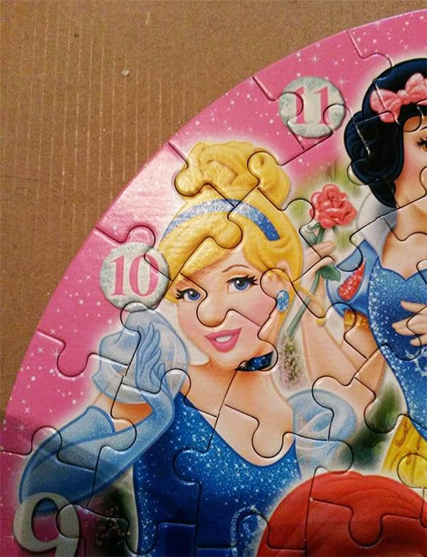
Cinderella highlighting the dangers of a nose job!
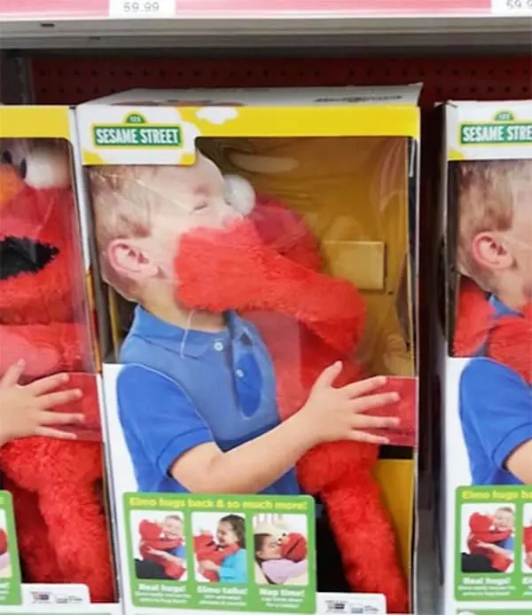
Interesting advertising technique…
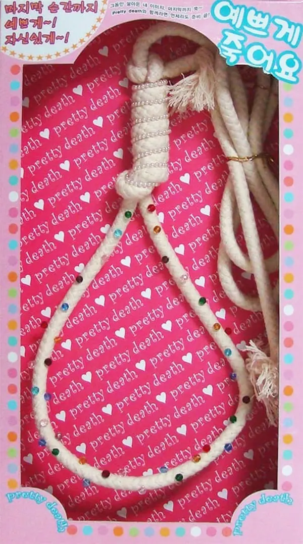
Because what every CHILD (and person in general) needs is a ‘pretty’ noose?
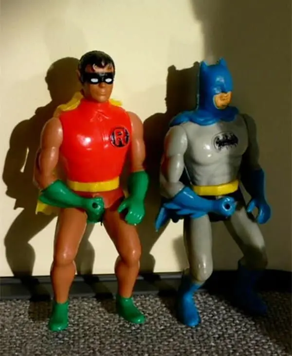
Why are the hands stuck like that?!
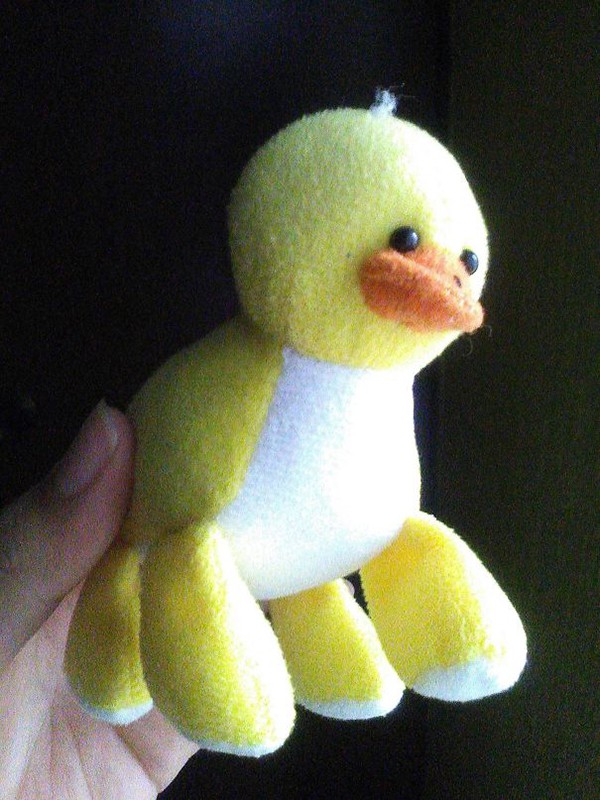
This four legged duck is actually kind of cute!
Keep Going To See More!
Scared of the dark? This Minnie Mouse night light could make it worse!
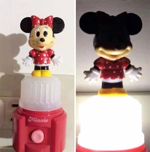
False advertising at its finest…
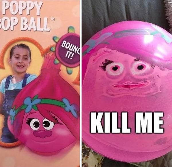
These items weren’t on sale for long.
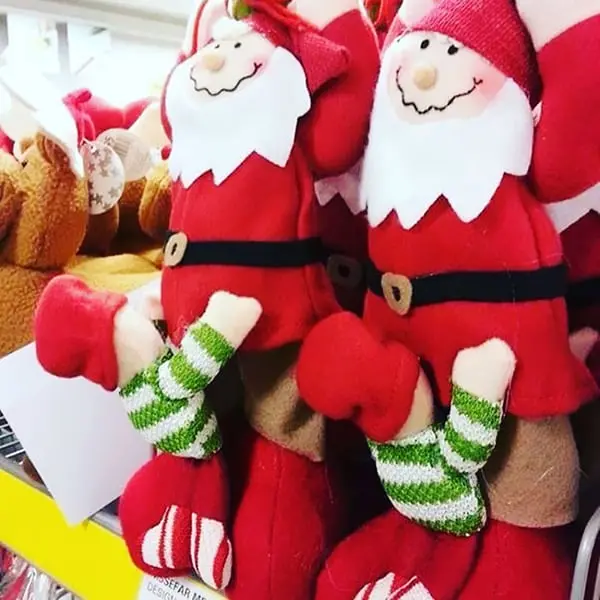
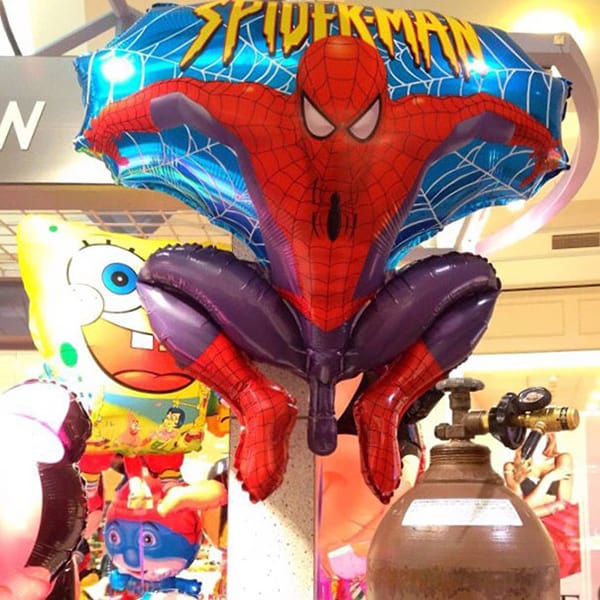
It’s like balloon designers do these things on purpose to play a joke on us all!
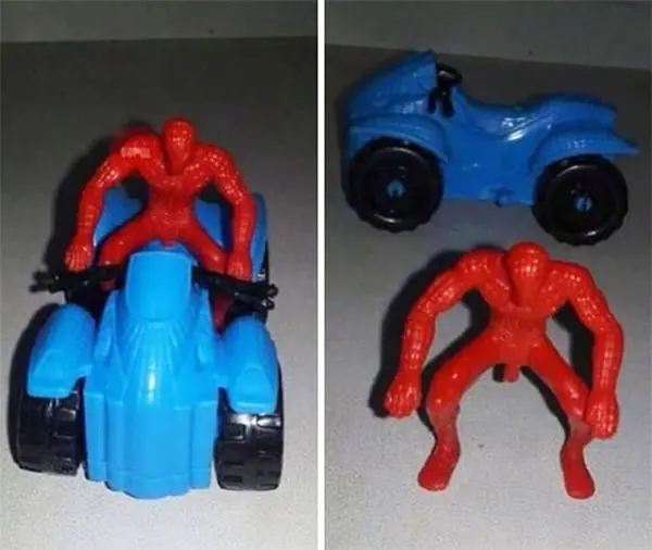
Hmm. Maybe Spiderman should stay attached to his vehicle at all times!
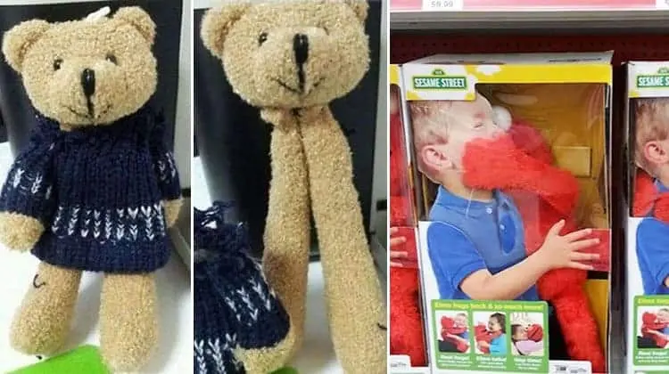
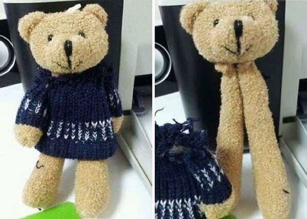
We’ll never look at a teddy bear in the same way again…
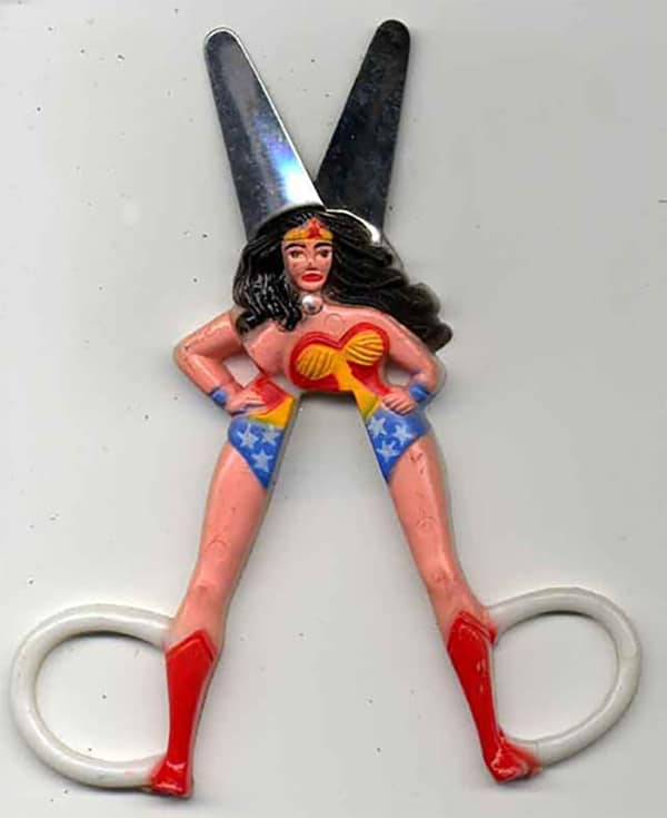
Wonder Woman has definitely seen better days…
