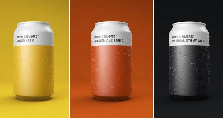
Innovative packaging design plays a vital role in marketing a product. Hence, the packaging itself must catch the eyes of the customers to ensure the product sells. These minimalist beer cans may look too plain but there’s actually more to them than meets the eye. These beer cans bear the pantone color that matches the color of the brew within because… why not?
Pantone is the color standardization system used in specifying printing inks that assist artists and designers in color matching and identification. Each shade has a corresponding code to identify each color. These beer-colored packaging was designed by Spanish designer Txaber who used both the exact hue and the pantone code on the labels to match the color of the brew inside. The pale lager, for example, comes in a bright yellow can along with its assigned pantone code 604 C.
These Beer Cans Show The Pantone Color Of The Brew Within
View this post on Instagram
This series of beer-colored packaging includes 9 brews including pale lager, lager, pilsner, wheat beer, golden ale, dark ale, porter, stout, and imperial stout. Aside from cans, the brews also come in other forms of packaging such as bottles and mugs.
While there’s no denying that the minimalist design makes the packaging look chic and sleek, we can’t honestly say the same to their choice of font. Hipstelvetica, seriously? Choosing a blurry font for the label of alcoholic beverages may not be the best way to go. But hey, we’ve got the feeling that this is specifically designed for designers who love to chug some beer for some boost of inspiration.
View this post on Instagram
View this post on Instagram
View this post on Instagram
View this post on Instagram
View this post on Instagram
View this post on Instagram
View this post on Instagram
View this post on Instagram
View this post on Instagram
View this post on Instagram
View this post on Instagram
View this post on Instagram

