Sometimes, in order to move forward, one must need to look back from where they’ve come from. That is certainly what Pizza Hut was thinking when they decided to revamp the franchise logo. Instead of going for a new logo design, the popular restaurant chain decided to bring back its old logo. But why would Pizza Hut go retro in this modern age?

Since Pizza Hut was founded in 1958, the restaurant has become the biggest pizza chain in the world. For many years, Pizza Hut has been the king of pizza as it stayed being the top pizza seller. However, its long-enduring reign would come to an end in 2017. Domino’s Pizza, its worthy rival, unseated Pizza Hut as the king of pizza in terms of global retail sales. Although Pizza Hut lost to its opponent by a hair, tailing behind the new proclaimed king of pizza is just unacceptable.
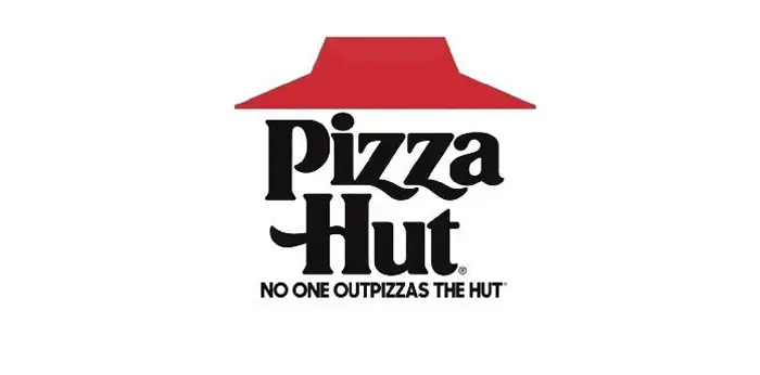
Determined to reclaim its throne, Pizza Hut responded with a campaign last year with a tagline ‘No One OutPizzas the Hut’. After losing its competitive edge in last 20 years, the pizza chain is finally ready to bounce back and fight. Apart from improving their recipe, the restaurant company also decided to change its logo as a part of the upgrade. As it turned out, the new logo wasn’t actually new. This time, the franchise opted to go retro by reusing its old logo. The classic logo which debuted in 1967 and lasted until 1999 will again appear on packaging later this year. We’ll also be expecting to see the new old logo in TV ads starting this week.
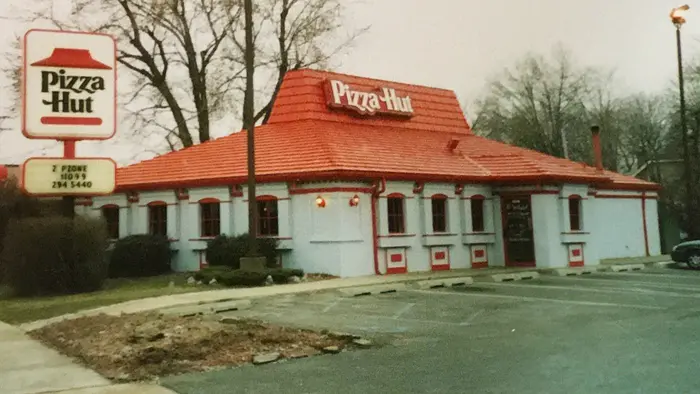
The classic logo which was introduced in 1967 but was redesigned in 1999

Pizza Hut’s old logo on its packaging

In 2018, Pizza Hut launched a campaign with a tagline ‘No One OutPizzas the Hut’ using the 1967 logo

But why choose this classic logo? For those who weren’t around back then, Pizza Hut had its highest peak in both sales and reputation from 1967 to 1999. After which, several competitors began to emerge, all of which have one goal in mind – to unseat the king. And Domino’s was able to do just that. Now, Pizza Hut is geared towards climbing to the top again. And looking back to its roots is one of the steps to achieve this.
“Pizza Hut is an iconic brand that is engrained in the hearts and minds of so many of our customers, we felt it was our job to make our creative reflect both the rich legacy of Pizza Hut, as well as nod to where we’re headed.”, Marianne Radley, the Hut’s Chief Brand Officer said.
For someone who had seen the classic logo before, it is rather nostalgic to see it again after so many years. Whether this marketing scheme proves successful or not, it’s still refreshing to have a company that reminds us that using your past can change your future.
